Lab 7 Manual Data Pipeline
1. Scenario
You are building a system to monitor Cars entering and exiting five carparks. The data that you are capturing is car plate number, time of entry, time of exit and the carpark. In the past two months there seemed to be a overcrowding issues at the carparks. You are to prepare the data for the Data Scientists and Analysts to investigate the issue.
We start this practical exercises with a common starting point, reading in data and explore the data using Microsoft Excel or other visualisations or dashboarding tools.
2. Prepare Python Environment
-
Open a terminal to run these commands to contain all your python codes in the python environment
mkdir -p ~/Documents/projects/ee3801 cd ~/Documents/projects/ee3801 python3 -m venv venv_ee3801 source venv_ee3801/bin/activate -
Open Visual Studio Code. Add Folder into Workspace (“~/Documents/projects/ee3801”).
-
Right click on the added folder
ee3801and create a new jupyter notebook file “manual_data_pipeline.ipynb”. -
Select Kernel - Python Environment “venv_ee3801”. (For Windows) Select your python interpreter first then kernel “Python: Select Interpreter” > “~/Documents/projects/ee3801/venv_ee3801/Script/python.exe”.
 # install python library

 !python -m pip install faker
 !python -m pip install pandas
 !python -m pip install matplotlib
 !python -m pip install --upgrade pip
When prompted “Running cells with ‘venv_ee3801 (Python 3.x.x)’ requires the ipykernel package.”, click Install.
 # import libraries

 from faker import Faker
 import json
 from datetime import datetime, timedelta
 import random
 import pandas as pd
 import matplotlib.pyplot as plt

 # set the date format
 date_format = "%d/%m/%Y %H:%M:%S"

 import os
 home_directory = os.path.expanduser("~")
 os.chdir(home_directory+'/Documents/projects/ee3801')
3. Generate data
-
Copy and paste these codes into your notebook and run.
# faker is a python library that generates fake data # here we want to generate fake data to simulate cars entering into the carpark fake=Faker() fake.license_plate() -
Define the CarPark class and declare function that generate cars entering the carpark for the past 3 months between 9 am to 8 pm for every minute and second.
# define the CarPark class class CarPark: def __init__(self, Plate, LocationID, Entry_DateTime, Exit_DateTime, Parking_Charges): self.Plate = Plate self.LocationID = LocationID self.Entry_DateTime = Entry_DateTime self.Exit_DateTime = Exit_DateTime self.Parking_Charges = Parking_Charges def generate_past_datetime(days): """ Generates a list of random datetime objects within the last 2-3 months, between 9 AM and 8 PM, including minute and second precision. Returns: datetime object. """ # generated_dates = [] now = datetime.now() # Define the time range for the past n months end_date = now start_date = now - timedelta(days=days) time_delta_total_seconds = int((end_date - start_date).total_seconds()) # Generate a random number of seconds within the 2-3 month range random_seconds_past = random.randint(0, time_delta_total_seconds) random_date_base = start_date + timedelta(seconds=random_seconds_past) # Generate random time components between 9 AM and 8 PM random_hour = random.randint(9, 20) # 9 to 20 (inclusive for 8 PM) random_minute = random.randint(0, 59) random_second = random.randint(0, 59) # Combine date and time components generated_datetime = random_date_base.replace( hour=random_hour, minute=random_minute, second=random_second, microsecond=0 # Set microseconds to 0 for minute/second precision ) return generated_datetime # generate cars entering the carpark for the past 2-3 months between 9 am to 8 pm for every minute and second def createPastCarEntry(): car = CarPark( Plate= fake.license_plate(), LocationID="Park"+str(random.randint(0, 5)), Entry_DateTime=generate_past_datetime(90).strftime(date_format), # Approximately 3 months ago Exit_DateTime="", Parking_Charges=float(0) ) # return a json format return json.dumps(car.__dict__) -
Generate 1000 cars.
# Generate 1000 cars carpark_system = [] for i in range(1000): thiscar_dict = eval(createPastCarEntry()) carpark_system.append(list(thiscar_dict.values())) carpark_system_df = pd.DataFrame(carpark_system, columns=list(eval(createPastCarEntry()).keys())) print(len(carpark_system_df)) carpark_system_df.head() -
Save to csv file for analysis.
 # export to csv for further analysis
 carpark_system_df.to_csv("data/carpark_system.csv", encoding='utf-8-sig', index=False)
4. Python Visualisation
-
In your notebook, plot the data to show the total number of cars in each location.
carpark_system_df.groupby(['LocationID'])['LocationID'].count().plot(title="Total number of cars in each location") index_carpark_system_df = carpark_system_df.set_index('Entry_DateTime') index_carpark_system_df.index = pd.to_datetime(index_carpark_system_df.index, errors='coerce') -
Plot a chart to show which time of the day has more cars entering the carpark.
df = pd.DataFrame({'hour':index_carpark_system_df.index.hour, 'plate': index_carpark_system_df['Plate']})\ .groupby('hour')['plate'].count() ax = df.plot(title="Total number of cars in each hour of the day") # show data labels for i, txt in enumerate(df): ax.annotate(txt, (df.index[i], df.values[i]), textcoords="offset points", xytext=(0,5), ha='center') plt.show() -
Plot a chart to show how many cars is in each carpark at every hour. Is the carparks overcrowded?
 pd.DataFrame({'hour':index_carpark_system_df.index.hour,
     'plate': index_carpark_system_df['Plate'],
     'carpark': index_carpark_system_df['LocationID']})\
     .groupby(['hour','carpark'])['plate'].count()
df = pd.DataFrame({'hour':index_carpark_system_df.index.hour, 'plate': index_carpark_system_df['Plate'], 'carpark': index_carpark_system_df['LocationID']})\ .groupby(['hour','carpark'])['plate'].count() df.unstack().plot(title="Number of cars in the car park in each hour of the day")
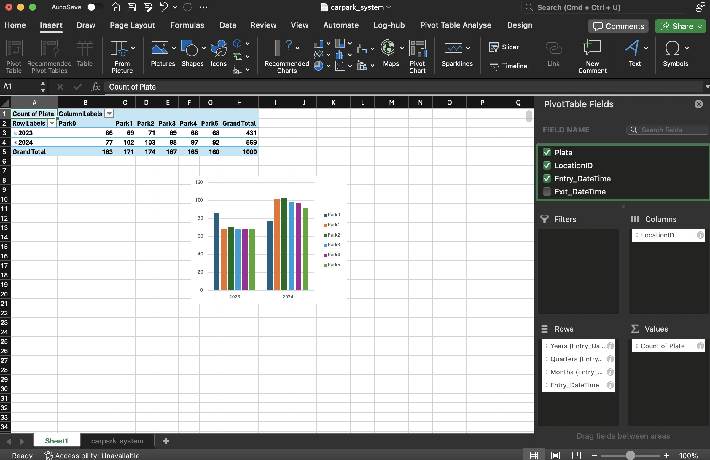
5. Microsoft Excel (Pivot Tables)
-
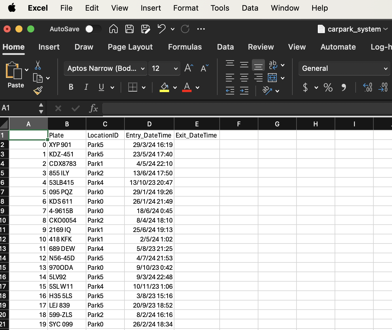
Open the carpark_system.csv file in Microsoft Excel.
-
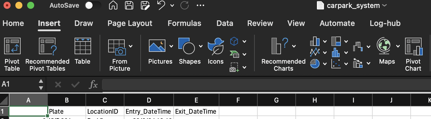
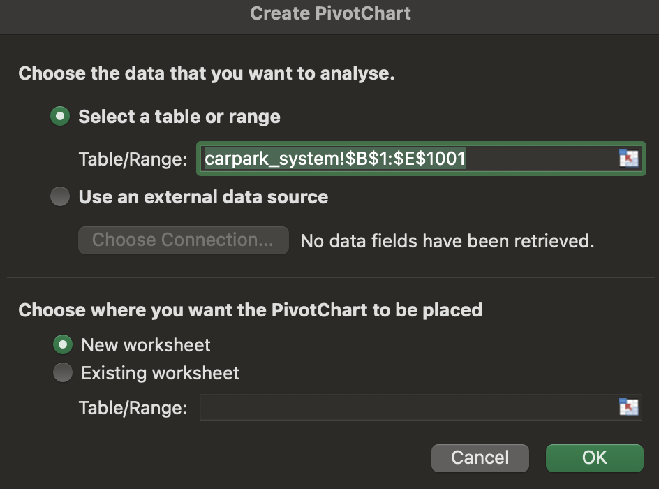
Click on Insert > Pivot Chart > Ok
-
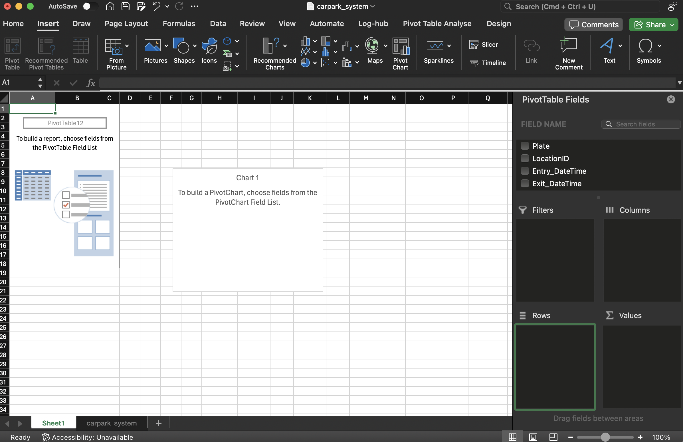
A new worksheet will be opened.
-
Drag and drop the field name Entry_DateTime into Rows, Plate into Values, LocationID into Columns. Note: If the date does not show Month or Day groupings, go to your system date settings and set to English (Singapore).
6. Microsoft Power BI
The amount of data might increase as the days goes by, we want to quickly visualise the charts everytime we refresh the data.
For Windows users,
-
Go to powerbi.microsoft.com. Download and install Microsoft Power BI.
-
Start MS Power BI.
For Mac users,
-
Launch the VMWAre Horizon Client and create connection to https://thinlab.nus.edu.sg
-
Launch the virtual machine, click on “Virtual Student Desktop”.
-
Login using
nusstu\<your student id>and password -
In the virtual windows, start MS Power BI.
-
Your computer will need to be in NUS VPN.
Loading and visualising data
-
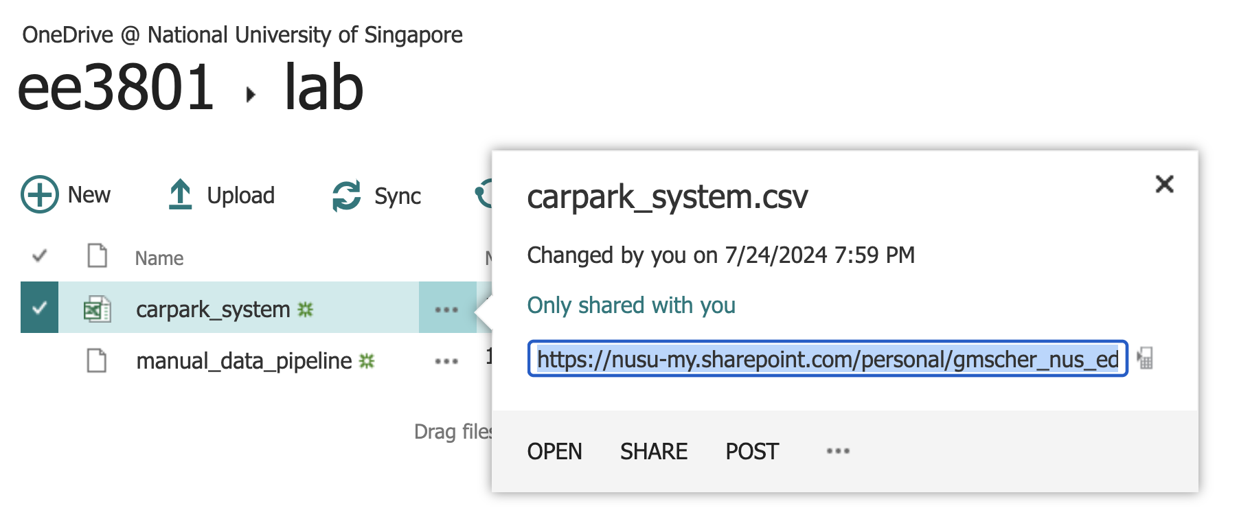
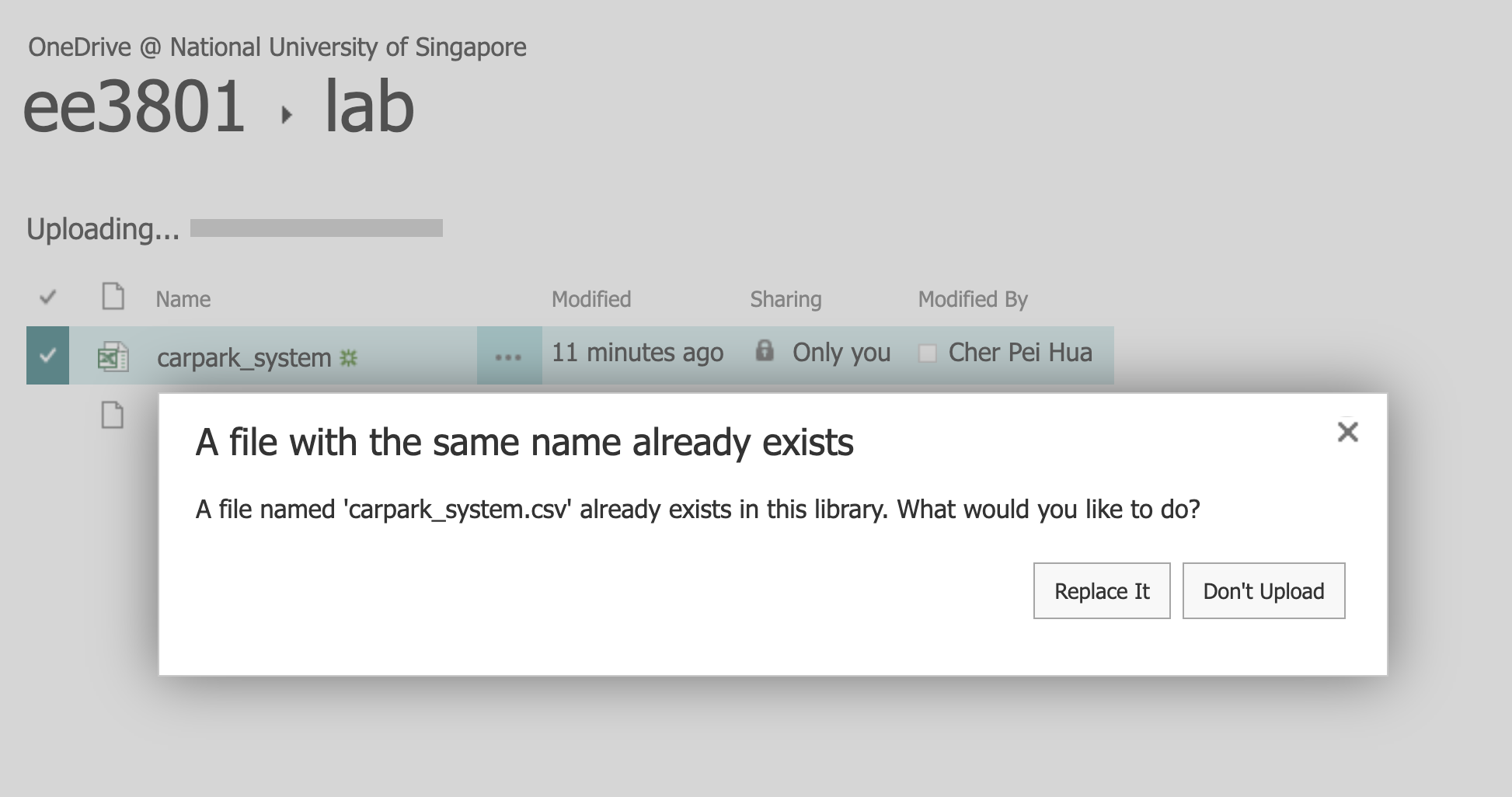
Upload your generated carpark_system.csv file into OneDrive:
”~/Library/CloudStorage/OneDrive-NationalUniversityofSingapore/ee3801/data/carpark_system.csv”.
-
Right click on the triple dots (…) and copy the link.
-
Open MS Power BI Desktop.
-
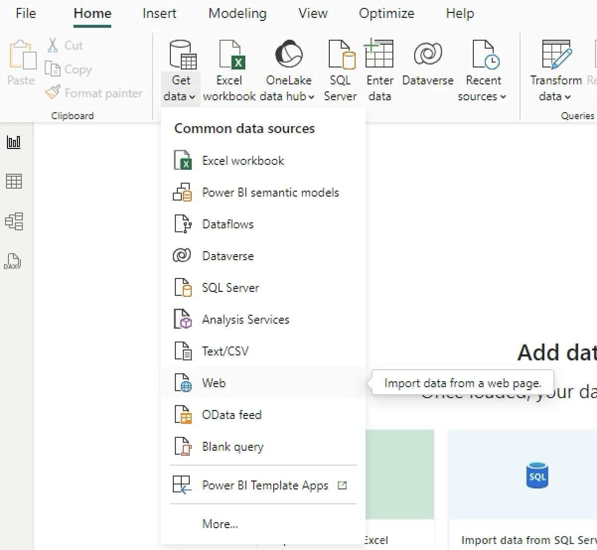
Select New > Report.
-
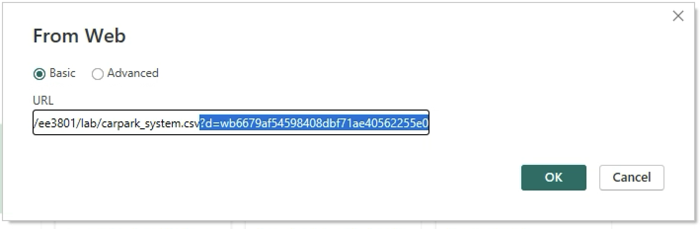
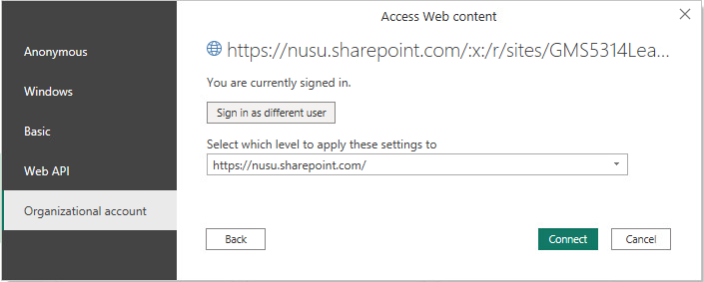
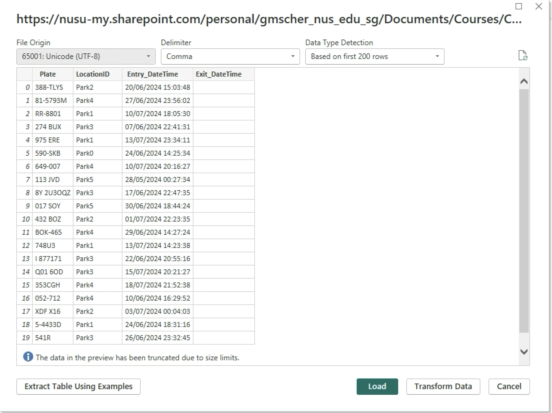
Select Get Data > Web. Paste the link that you have copied in step 2. Remove the question mark (?), parameters and values at the end of the link. Click Ok and Load. Authentication prompt might pop up, select Organisation > Sign in > Connect.
-
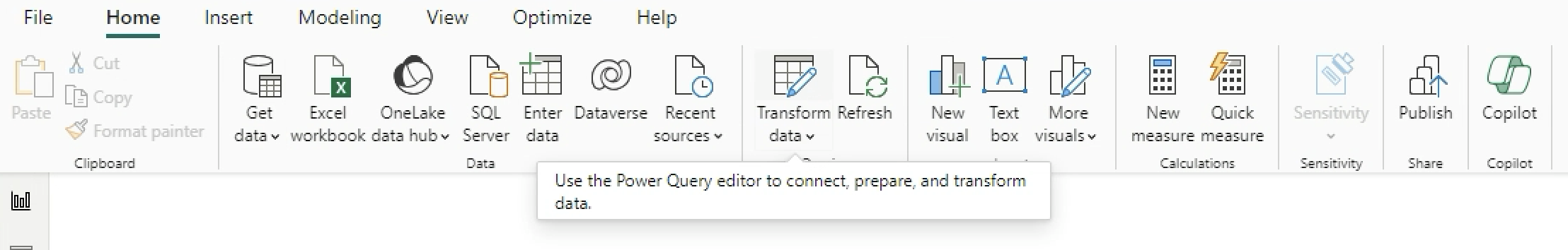
Select Transform Data.
-
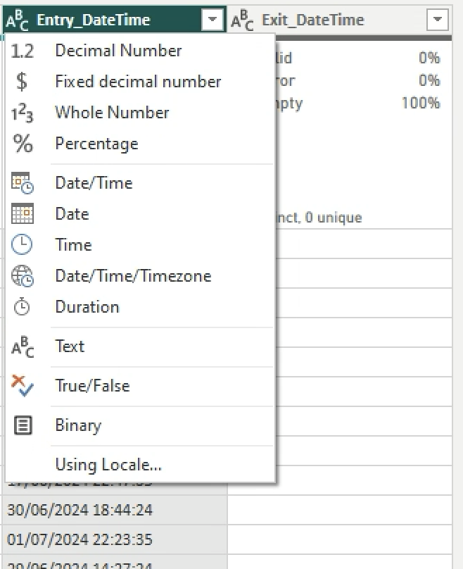
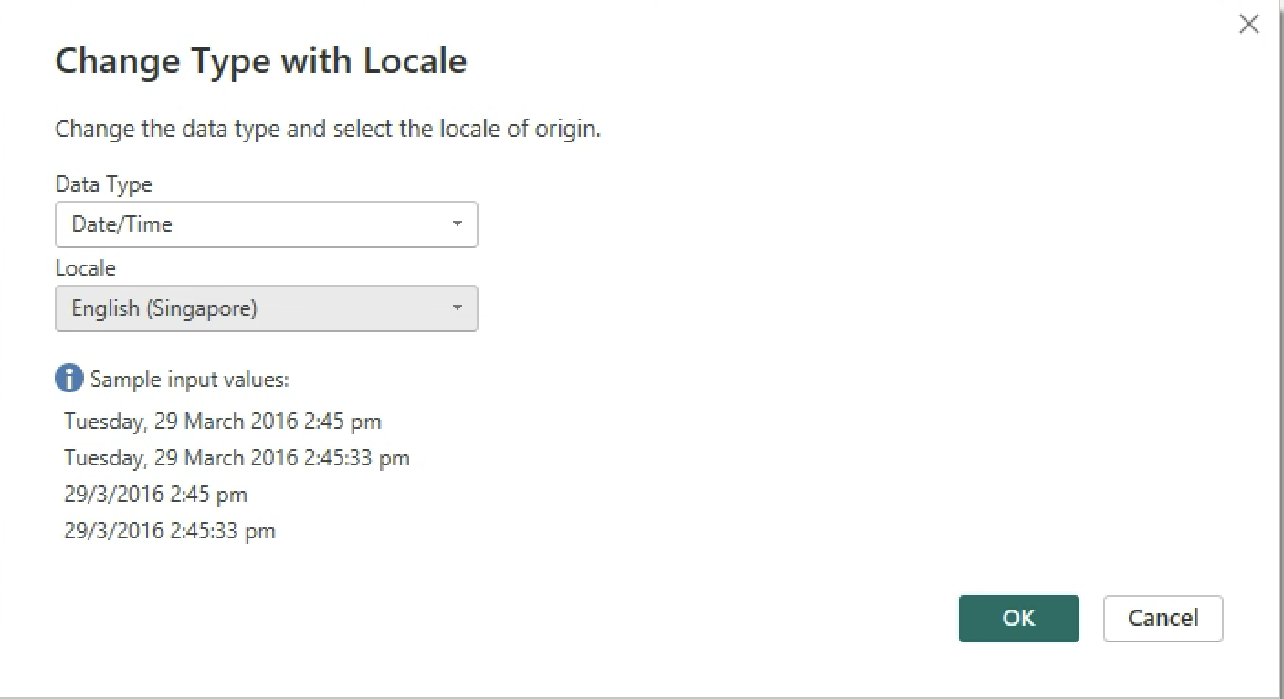
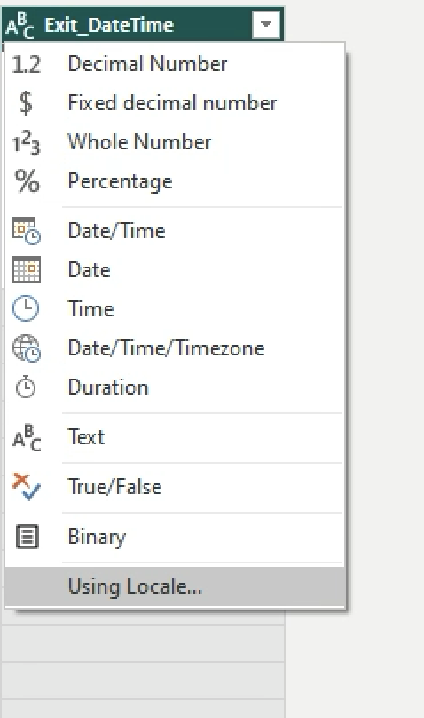
Change the Data Type of Entry_DateTime and Exit_DateTime to Locale > DateTime > Locale > English (Singapore).
-
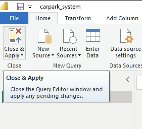
Save your MS Power BI file as carpark_system.pbix. Click on Apply. Click on Close and Apply.
-
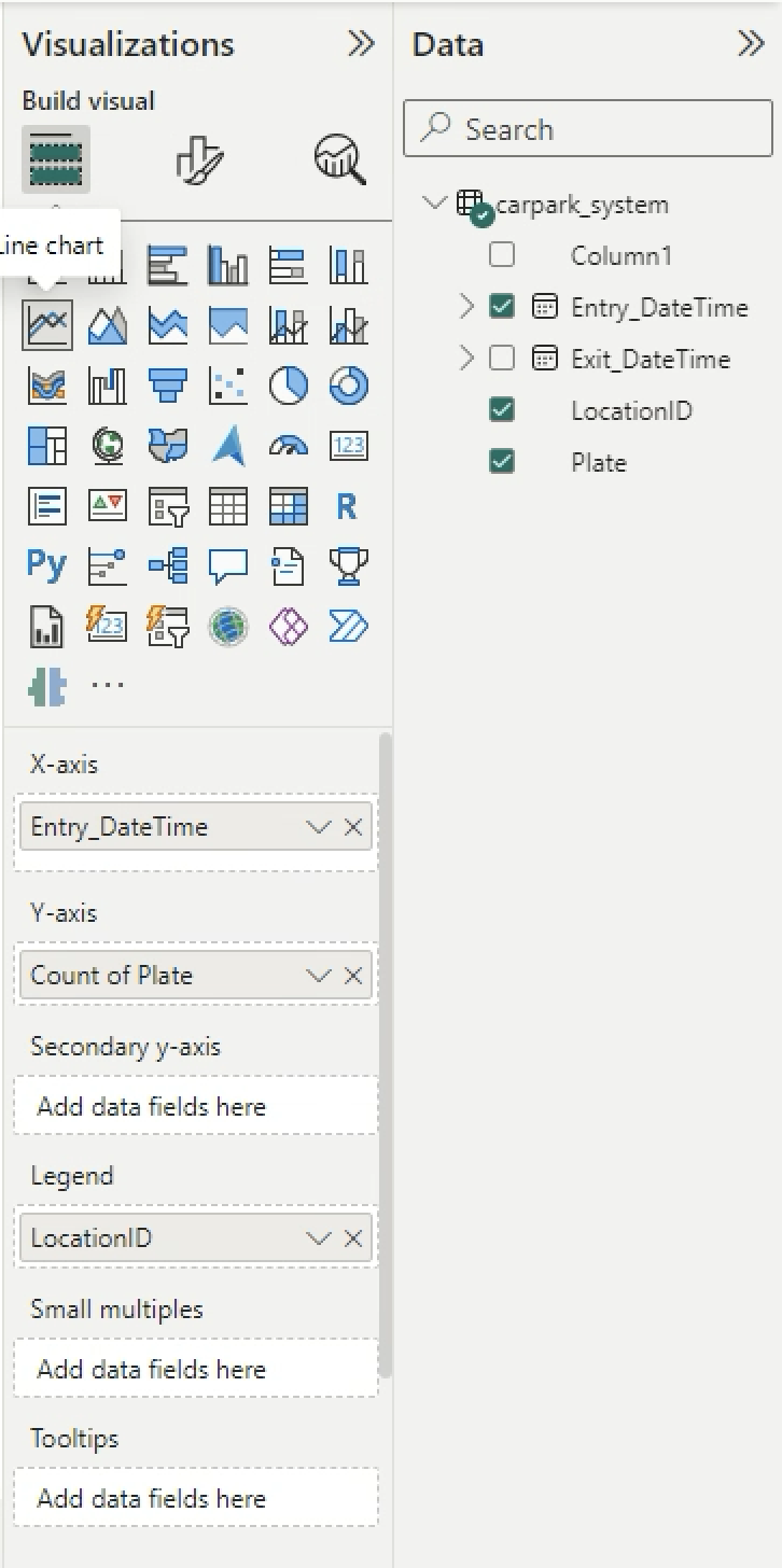
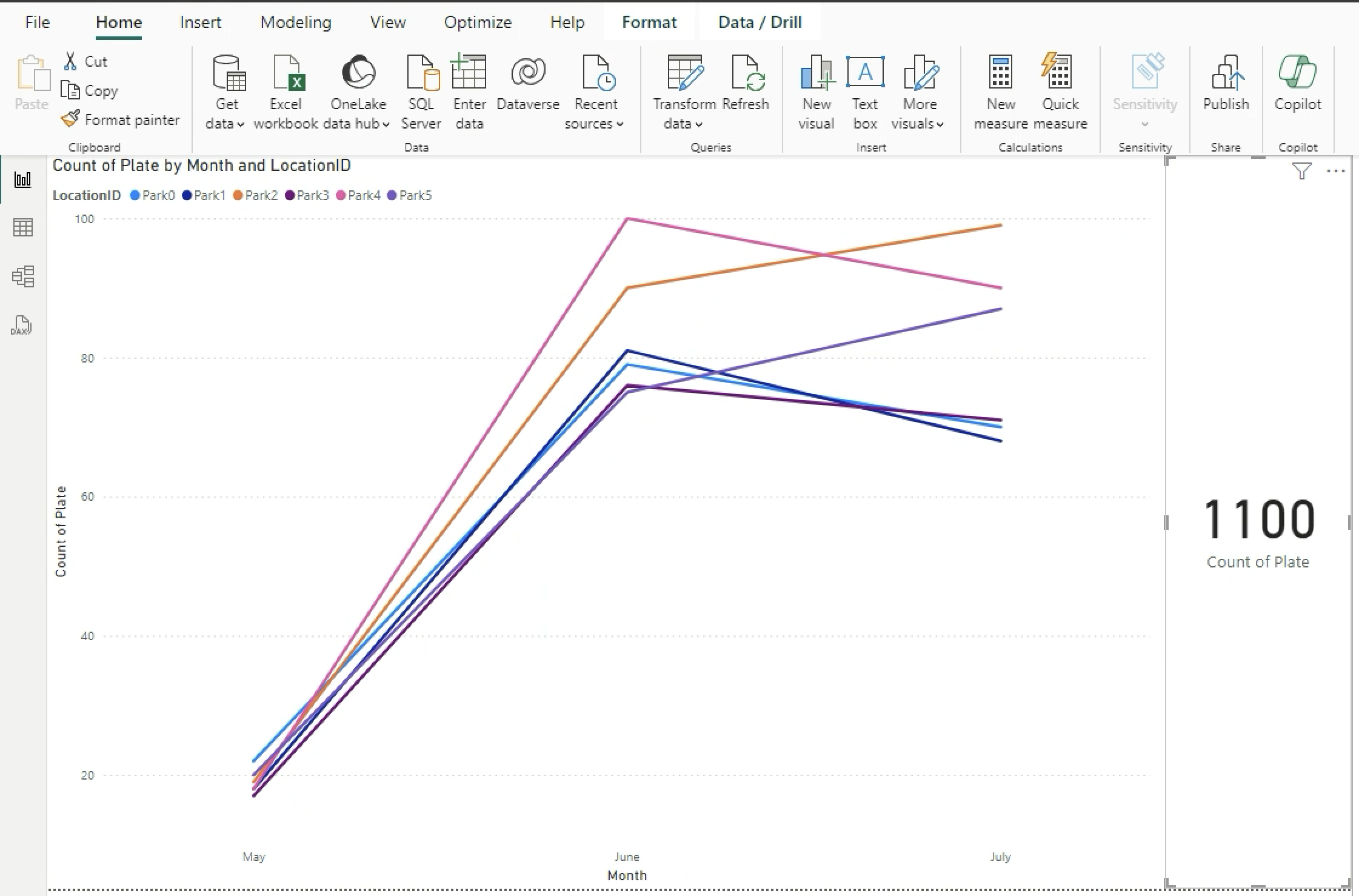
Drag and drop the Line chart into the workspace. Drag and drop Entry_DateTime into X-axis, Plate into Y-axis, LocationID into Legend.
-
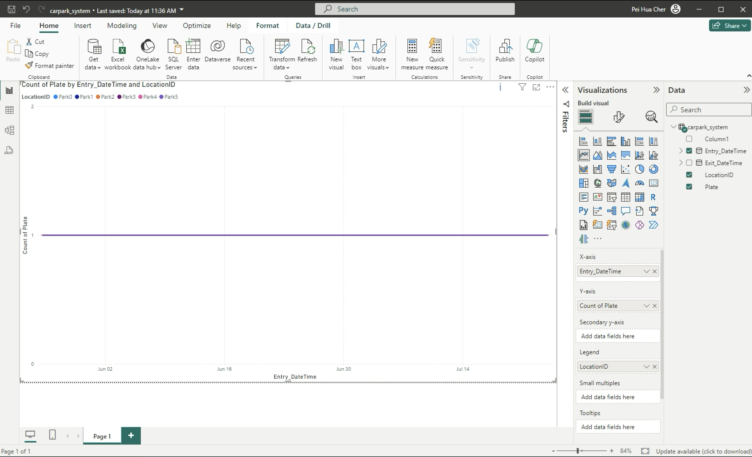
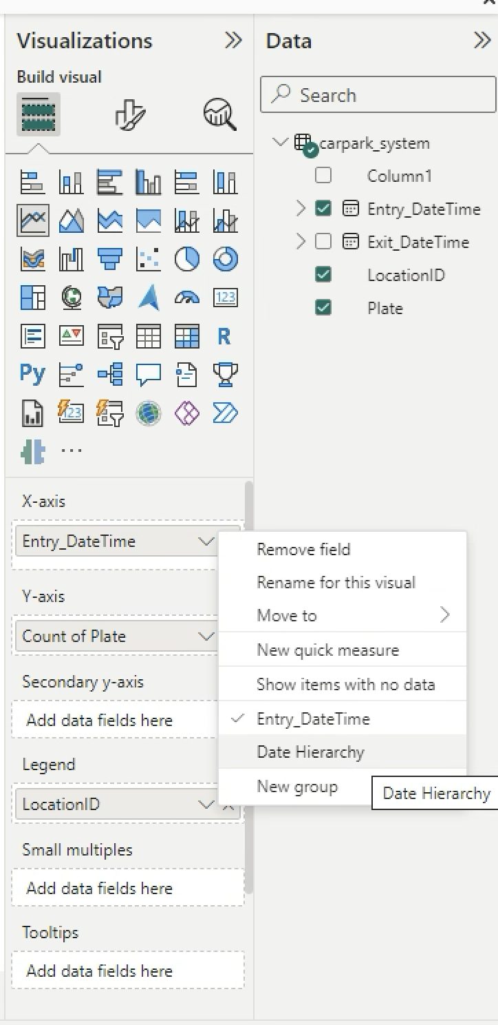
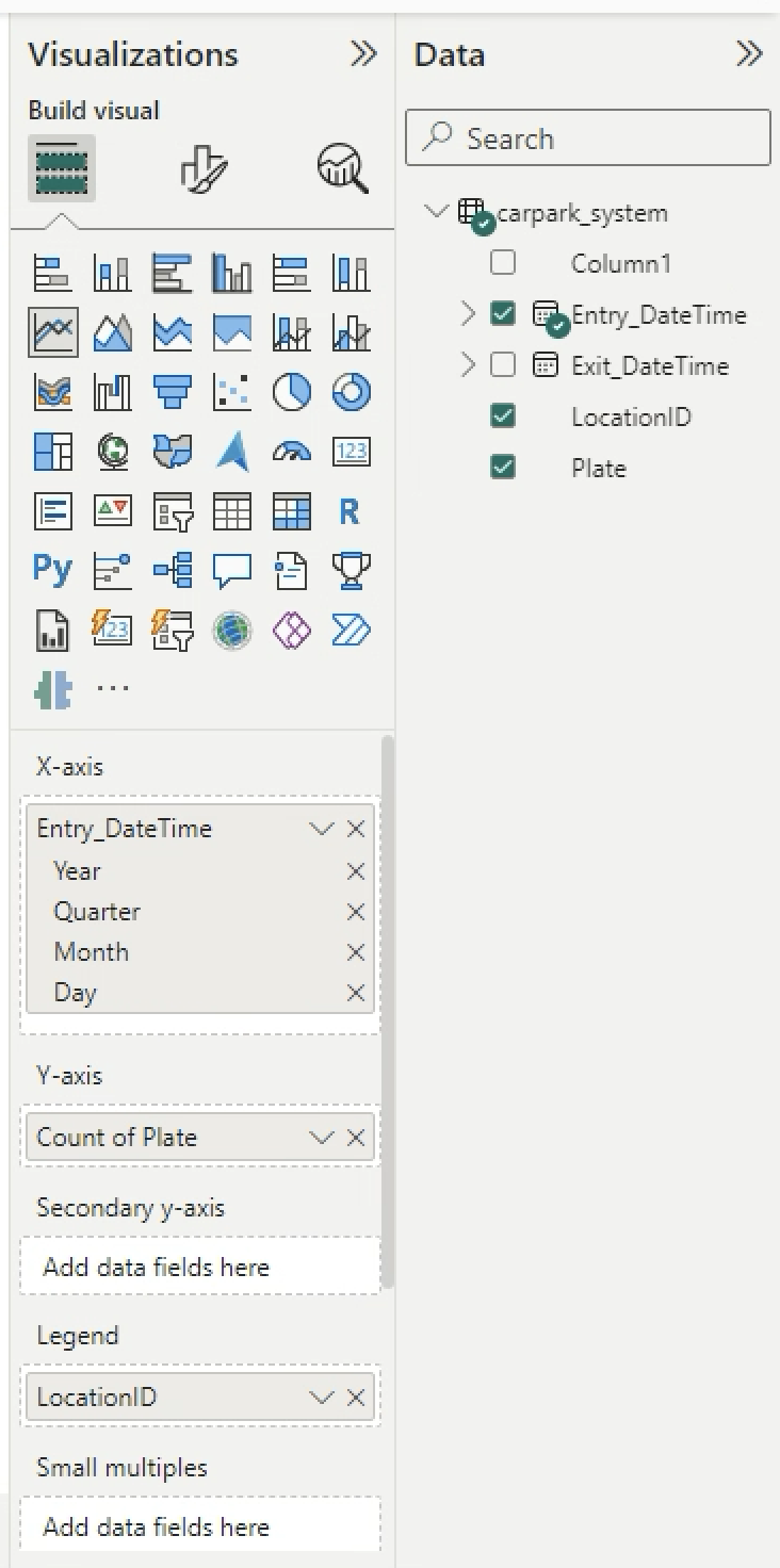
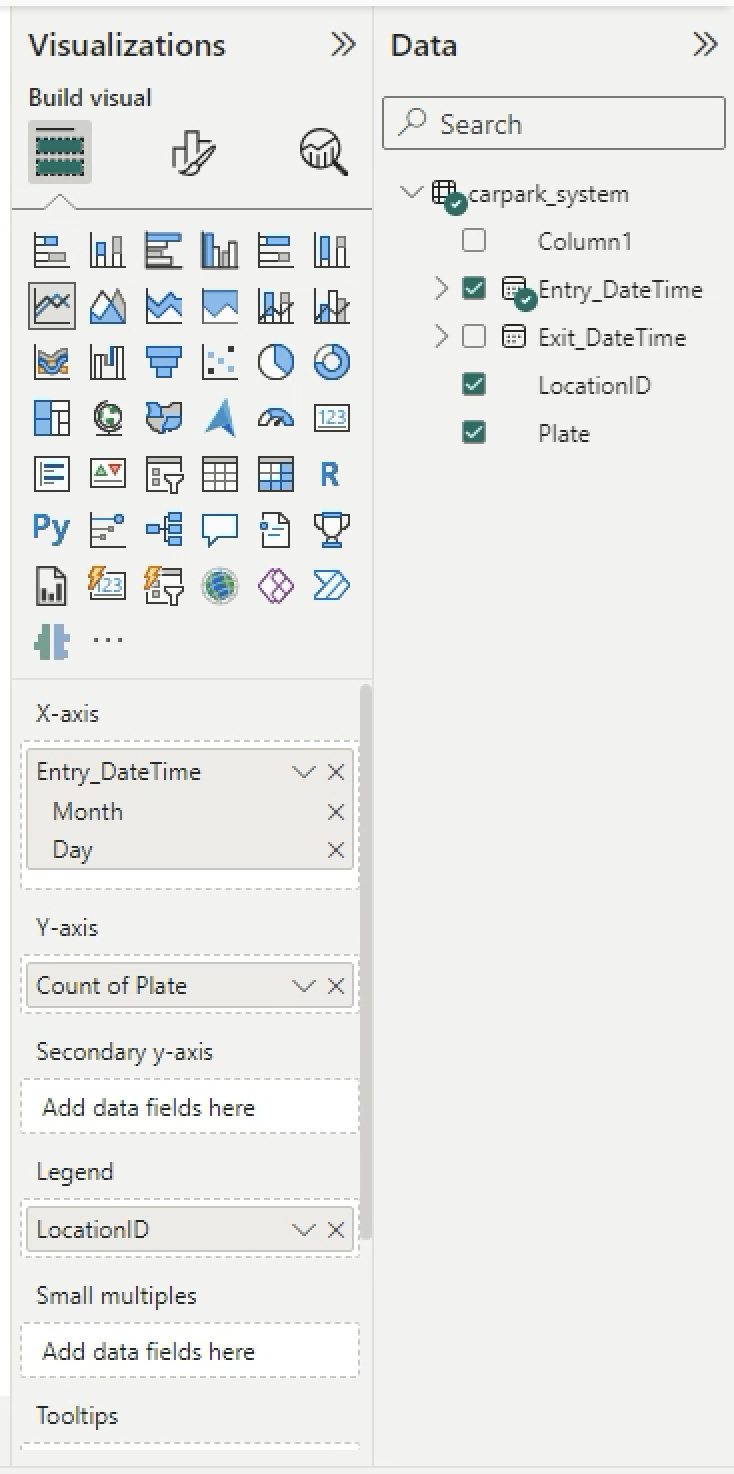
You can see the chart. Click on the arrow down (V) beside X-axis Entry_DateTime > Choose Date Hierarchy. Remove Year and Qtr.
-
New data is coming in… Use the codes below to generate new car entry for every hour from 9 am to 8 pm for every minute and second.
def createNewCarEntry(): car = CarPark( Plate= fake.license_plate(), LocationID="Park"+str(random.randint(0, 5)), Entry_DateTime=generate_past_datetime(1).strftime(date_format), # Approximately 1 day ago Exit_DateTime="", Parking_Charges=float(0) ) return json.dumps(car.__dict__) -
Generate 100 cars.
# read latest file carpark_system_df = pd.read_csv("data/carpark_system.csv", encoding='utf-8-sig', index_col=False) # carpark_system_df.drop(columns=['Unnamed: 0'], inplace=True) print(len(carpark_system_df)) carpark_system_df.head() # Generate more cars, append to list and save csv carpark_system = [] for i in range(100): thiscar_dict = eval(createNewCarEntry()) carpark_system.append(list(thiscar_dict.values())) new_carpark_system_df = pd.DataFrame(carpark_system, columns=list(eval(createNewCarEntry()).keys())) print(len(new_carpark_system_df)) print(new_carpark_system_df.head()) updated_carpark_system_df = pd.concat([carpark_system_df,new_carpark_system_df], axis=0) print(len(updated_carpark_system_df)) updated_carpark_system_df.head() # export to csv for further analysis updated_carpark_system_df.to_csv("data/carpark_system.csv", encoding='utf-8-sig', index=False) # export to your OneDrive too for on-demand refresh (replace your file in OneDrive) updated_carpark_system_df.to_csv("~/Library/CloudStorage/OneDrive-NationalUniversityofSingapore/ee3801/data/carpark_system.csv", encoding='utf-8-sig', index=False) -
The codes above should replace the carpark_system.csv in OneDrive. However if it failed you can still manually copy and replace your generated carpark_system.csv file into OneDrive.
-
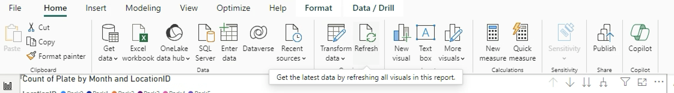
In MS Power BI, click on the refresh button.
-
Drag and drop the Card into the workspace and count the number of Plates.
Conclusion
In this lab, you learned the
- manual task of generating data,
- visualising using python,
- Microsoft Excel and
- created a simple data pipeline in Microsoft Power BI.
This is the most simple form of data pipeline that is often the first steps in an organisation with a basic data maturity level. However this is an essential step towards building a more automated streamlined data pipeline.
Questions to ponder
- With MS Sharepoint through OneDrive and MS Power BI we are able to see the latest data by one click. How do we remove the step to click and yet refresh the data?
- What is the time taken to refresh the data?
- As the data refreshes only when you click on the refresh button, if you have multiple users how do you share this data with them and how do you ensure that they will access up-to-date data?
- What if your company does not subscribe to Microsoft Power Platform?
Submissions next Wed 9pm (8 Oct 2025)
Submit your ipynb as a pdf, excel file and pbi file. Save your ipynb as a html file, open in browser and print as a pdf. Include in your submission:
Answer the Questions to ponder
~ The End ~